Content for Tab 1
vista.css
A CSS framework for building interface components that look like Windows Vista.
Intro
vista.css is a CSS framework for building interface components that look like Windows Vista. It is built as an extension of 7.css, which is built on top of the GUI backbone of XP.css and 98.css.
Hello, world!
This framework relies on the usage of semantic HTML. To make a button, you'll need
to use a <button>. Input elements require labels. Tabs rely on the role="tab"
attribute. This page will guide you through that process, but accessibility is a primary goal of this project.
You can override many of the styles of your elements while maintaining the appearance provided by this framework. Need more padding on your buttons? Go for it. Need to add some color to your input labels? Be our guest.
This framework does not contain any JavaScript, it merely styles your HTML with some CSS. This means vista.css is compatible with your frontend framework of choice.
Installation / Usage
Download the source and drop the compiled CSS into your project:
<link rel="stylesheet" href="dist/vista.css">
For the full Vista experience with icons and gadgets, include the asset directories
(dist/gui/taskbar/, dist/gui/gadgets/, etc.) alongside the CSS.
See the
GitHub repository for the complete source.
To scope the styles, add the .vista class to your container and use the scoped build:
<link rel="stylesheet" href="dist/vista.scoped.css">
<div class="vista">
  <button>Vista Button</button>
</div>
Components
Balloon
A balloon is a small pop-up window that provides additional information about an element when the user interacts with it.
Balloons are created using role="tooltip".
This is a balloon tooltip.
Show code
<div role="tooltip">This is a balloon tooltip.</div>Button
A command button, also referred to as a push button, is a control that causes the application to perform some action when the user clicks it.
A standard button measures 75px wide and 23px tall with 12px of horizontal padding by default.
Show code
<button>Click me</button>When buttons are clicked, the gray gradient is shifted to corresponding sky blues. The following button is simulated to be in the pressed (active) state.
Show code
<button class="active" >I am being pressed</button>Disabled buttons have solid background and lighter border.
Show code
<button disabled>I cannot be clicked</button>Button focus is communicated with a dotted border, set 4px within the contents of the button. The following example is simulated to be focused.
Show code
<button class="focused" >I am focused</button>A default button has a greenish-blue border and a light blue gradient shade.
Show code
<button class="default">I am the one!</button>
You can use a label with the role="button" attribute for file inputs.
Show code
<label role="button" tabindex="0"><input type="file" /> Choose file</label>
<label role="button" tabindex="0" class="default"><input type="file" /> Browse...</label>CheckBox
A check box represents an independent or non-exclusive choice.
Show code
<div class="group">
  <input type="checkbox" id="cb1" checked><label for="cb1">Checked</label>
  <input type="checkbox" id="cb2"><label for="cb2">Unchecked</label>
  <input type="checkbox" id="cb3" disabled><label for="cb3">Disabled</label>
  <input type="checkbox" id="cb4" checked disabled><label for="cb4">Checked Disabled</label>
</div>Collapse
A control that shows or hides content with a toggle.
Click to expand
This content is hidden until expanded.
Show code
<details>
  <summary>Click to expand</summary>
  <p>This content is hidden until expanded.</p>
</details>ComboBox
A combo box combines a text box with a drop-down list.
Show code
<div class="combobox">
  <input type="text" value="Select or type..." style="width: 180px" />
  <button aria-label="dropdown" style="height: 23px"></button>
</div>Dropdown
A drop-down list allows users to select one item from a list.
Show code
<select>
  <option>Option 1</option>
  <option>Option 2</option>
  <option>Option 3</option>
</select>Show code
<select disabled><option>Disabled dropdown</option></select>GroupBox
A group box is a labeled rectangular frame that surrounds a set of related controls.
Show code
<fieldset>
  <legend>Group Box</legend>
  <input type="radio" id="gb1" name="gb" checked><label for="gb1">Option 1</label>
  <input type="radio" id="gb2" name="gb"><label for="gb2">Option 2</label>
</fieldset>ListBox
A list box allows users to select one or more items from a list.
Show code
<select multiple size="4" style="width: 180px">
  <option>Item 1</option>
  <option selected>Item 2</option>
  <option>Item 3</option>
  <option>Item 4</option>
</select>ListView (Table)
A list view is a control that displays a collection of items in a table format.
| Name | Type | Date Modified |
|---|---|---|
| Documents | Folder | 1/1/2025 |
| Pictures | Folder | 12/15/2024 |
| readme.txt | Text File | 1/5/2025 |
Show code
<table>
  <thead>
    <tr>
      <th style="width: 200px">Name</th>
      <th style="width: 100px">Type</th>
      <th style="width: 120px">Date Modified</th>
    </tr>
  </thead>
  <tbody>
    <tr><td>Documents</td><td>Folder</td><td>1/1/2025</td></tr>
    <tr><td>Pictures</td><td>Folder</td><td>12/15/2024</td></tr>
    <tr><td>readme.txt</td><td>Text File</td><td>1/5/2025</td></tr>
  </tbody>
</table>Navigation
The following components compose a complete navigation menu, also known as Navbar.
Menu
A menu displays a list of commands or options.
MenuBar
A menu bar displays a set of top-level menus horizontally.
- File
- Edit
- View
- Help
Show code
<ul role="menubar">
  <li role="menuitem">File</li>
  <li role="menuitem">Edit</li>
  <li role="menuitem">View</li>
  <li role="menuitem">Help</li>
</ul>OptionButton (Radio)
An option button, also referred to as a radio button, represents a single choice within a set of mutually exclusive options.
Show code
<div class="group">
  <input type="radio" id="r1" name="radio-group" checked><label for="r1">Selected</label>
  <input type="radio" id="r2" name="radio-group"><label for="r2">Unselected</label>
  <input type="radio" id="r3" name="radio-group2" disabled><label for="r3">Disabled</label>
</div>ProgressBar
A common control that displays the progress of a particular operation as a graphical bar.
Progress bars are created with a div using role="progressbar",
with a nested div to make the inner bar.
Show code
<div role="progressbar" aria-valuemin="0" aria-valuemax="100" aria-valuenow="80">
  <div style="width: 80%"></div>
</div>Paused state with paused class.
Show code
<div role="progressbar" class="paused">
  <div style="width: 50%"></div>
</div>Error state with error class.
Show code
<div role="progressbar" class="error">
  <div style="width: 30%"></div>
</div>Animated with animate class.
Show code
<div role="progressbar" class="animate">
  <div style="width: 60%"></div>
</div>Indeterminate with marquee class.
Show code
<div role="progressbar" class="marquee"></div>Scrollbar
A scroll bar appears when content exceeds the visible area.
Add class has-scrollbar to enable custom WebKit scrollbar styling.
Show code
<div class="has-scrollbar" style="height: 100px; overflow-y: scroll; border: 1px solid #ccc; padding: 8px;">
  <p>Scrollable content with Vista-styled scrollbar.</p>
  <p>More lines...</p>
  <p>More lines...</p>
  <p>More lines...</p>
  <p>More lines...</p>
  <p>End of content.</p>
</div>SearchBox
A search box provides a way for users to search for specific content.
Show code
<input type="search" placeholder="Search..." />Show code
<div class="searchbox">
  <input type="search" placeholder="Search..." style="width: 200px" />
  <button aria-label="search"></button>
</div>Slider
A slider, also known as a track bar, allows users to set a value within a range.
Show code
<input type="range" min="0" max="100" value="50" />Show code
<input type="range" class="has-box-indicator" min="0" max="100" value="30" />Show code
<input type="range" min="0" max="100" value="40" disabled />Spinner
A spinner, or indeterminate progress indicator, shows that an operation is in progress.
Show code
<div class="spinner animate"></div>Show code
<div class="spinner"></div>Tabs
Tabs provide a way to present related information on separate labeled pages.
Content for Tab 2
Content for Tab 3
Show code
<div>
  <menu role="tablist" aria-label="Sample Tabs">
    <button role="tab" aria-selected="true" aria-controls="tab-content-1">Tab 1</button>
    <button role="tab" aria-controls="tab-content-2">Tab 2</button>
    <button role="tab" aria-controls="tab-content-3">Tab 3</button>
  </menu>
  <article role="tabpanel" id="tab-content-1">
    <p>Content for Tab 1</p>
  </article>
  <article role="tabpanel" id="tab-content-2" hidden>
    <p>Content for Tab 2</p>
  </article>
  <article role="tabpanel" id="tab-content-3" hidden>
    <p>Content for Tab 3</p>
  </article>
</div>TextBox
A text box is a control that allows users to enter text.
Show code
<input type="text" placeholder="Enter text..." />Show code
<input type="text" placeholder="Hover me" />Show code
<input type="text" placeholder="Focused" class="focused" autofocus />Show code
<input type="text" placeholder="Disabled" disabled />Show code
<textarea rows="3" placeholder="Multi-line text..."></textarea>TreeView
A tree view displays a hierarchical list of items.
Show code
<ul class="tree-view has-collapse-button has-container" style="max-width: 250px">
  <li><a href="#">Desktop</a></li>
  <li>
    <details open>
      <summary><a href="#">Documents</a></summary>
      <ul>
        <li><a href="#">Projects</a></li>
        <li><a href="#">Photos</a></li>
      </ul>
    </details>
  </li>
  <li>
    <details>
      <summary><a href="#">Computer</a></summary>
      <ul>
        <li><a href="#">Local Disk (C:)</a></li>
        <li><a href="#">DVD Drive (D:)</a></li>
      </ul>
    </details>
  </li>
</ul>Window
The following components illustrate how to build complete windows using vista.css.
Title Bar
The title bar is the top portion of a window, displaying the window title and controls.
Show code
<div class="title-bar">
  <div class="title-bar-text">A Title Bar</div>
  <div class="title-bar-controls">
    <button aria-label="Minimize"></button>
    <button aria-label="Maximize"></button>
    <button aria-label="Close"></button>
  </div>
</div>Active window title bar:
Show code
<div class="window active" style="max-width: 100%">
  <div class="title-bar">
    <div class="title-bar-text">My Application</div>
    <div class="title-bar-controls">
      <button aria-label="Minimize"></button>
      <button aria-label="Maximize"></button>
      <button aria-label="Close"></button>
    </div>
  </div>
</div>Window Body
The window body contains the main content area of a window.
This is the window body content area.
Show code
<div class="window active" style="max-width: 100%">
  <div class="title-bar">
    <div class="title-bar-text">Window with Body</div>
    <div class="title-bar-controls">
      <button aria-label="Minimize"></button>
      <button aria-label="Close"></button>
    </div>
  </div>
  <div class="window-body has-space">
    <p>This is the window body content area.</p>
    <button>OK</button>
    <button>Cancel</button>
  </div>
</div>Status Bar
A status bar displays information about the current state of the window.
Content goes here.
Show code
<div class="window active" style="max-width: 100%">
  <div class="title-bar">
    <div class="title-bar-text">Window with Status Bar</div>
    <div class="title-bar-controls">
      <button aria-label="Minimize"></button>
      <button aria-label="Close"></button>
    </div>
  </div>
  <div class="window-body has-space">
    <p>Content goes here.</p>
  </div>
  <div class="status-bar">
    <p class="status-bar-field">Ready</p>
    <p class="status-bar-field">Items: 42</p>
  </div>
</div>Glass frame & Color
The glass window frames are a striking new aspect of the Windows Vista Aesthetic, aiming to be both attractive and lightweight. These translucent frames give windows an open, less intrusive appearance, helping users focus on content and functionality rather than the interface surrounding it.
You can produce this effect with a glass class. The window frame
then becomes translucent and the background is blurred behind it.
The background behind is blurred.
Show code
<div class="background">
  <div class="window glass active" style="max-width: 100%">
    <div class="title-bar">
      <div class="title-bar-text">A glass window frame</div>
      <div class="title-bar-controls">
        <button aria-label="Minimize"></button>
        <button aria-label="Close"></button>
      </div>
    </div>
    <div class="window-body has-space">
      <p>The background behind is blurred.</p>
    </div>
  </div>
</div>
Override the default window color by redefining --vista-w-bg:
You can change the window color.
Even glass windows.
Show code
<div class="window active" style="max-width: 100%; --vista-w-bg: #805ba5;">
  <div class="title-bar">
    <div class="title-bar-text">A violet window frame</div>
    <div class="title-bar-controls">
      <button aria-label="Minimize"></button>
      <button aria-label="Close"></button>
    </div>
  </div>
  <div class="window-body has-space">
    <p>You can change the window color.</p>
  </div>
</div>

<div class="background">
  <div class="window glass active" style="max-width: 100%; --vista-w-bg: #805ba5;">
    <div class="title-bar">
      <div class="title-bar-text">A glass violet window frame</div>
      <div class="title-bar-controls">
        <button aria-label="Minimize"></button>
        <button aria-label="Close"></button>
      </div>
    </div>
    <div class="window-body has-space">
      <p>Even glass windows.</p>
    </div>
  </div>
</div>Dialog Box
A dialog box is a secondary window that allows users to perform a command, ask users a question, or provide information.
A dialog box can be created using role="dialog" and :target.
Show code
<a href="#dialog-demo">
  <button>Open Dialog</button>
</a>
<div class="window" role="dialog" id="dialog-demo" style="max-width: 90%">
  <div class="title-bar">
    <div class="title-bar-text">Dialog Box</div>
    <div class="title-bar-controls">
      <button aria-label="Close"></button>
    </div>
  </div>
  <div class="window-body has-space">
    <p>This is a dialog box. Click outside to close, or use the close button.</p>
    <section style="display: flex; justify-content: flex-end; gap: 6px">
      <button class="default">OK</button>
      <a href="#"><button>Cancel</button></a>
    </section>
  </div>
</div>Taskbar & Start Orb
Taskbar
The Windows Vista taskbar provides quick access to running applications and the Start menu. The iconic circular Start orb is the centerpiece of the Vista desktop experience.
The taskbar is a fixed bottom bar with glass translucency. It contains a
.start-orb, quick launch icons, running application tabs, and a system tray.
Show code
<div class="window active" style="max-width: 100%">
  <div class="title-bar">
    <div class="title-bar-text">Taskbar Preview</div>
    <div class="title-bar-controls">
      <button aria-label="Minimize"></button>
      <button aria-label="Close"></button>
    </div>
  </div>
  <div class="window-body has-space" style="padding-bottom: 55px; position: relative; overflow: hidden;">
    <p>A desktop application window above the taskbar.</p>
    <div class="taskbar" style="position: absolute; bottom: 0; left: 0; right: 0; border-radius: 0;">
      <div class="start-orb" aria-label="Start" tabindex="0"></div>
      <div class="taskbar-divider"></div>
      <div class="taskbar-quick-launch">
        <div class="quick-launch-icon ql-show-desktop" title="Show Desktop"></div>
        <div class="quick-launch-icon ql-explorer" title="Windows Explorer"></div>
      </div>
      <div class="taskbar-divider"></div>
      <div class="taskbar-items">
        <div class="taskbar-item active"><div class="taskbar-item-icon" style="background-image:url('data:image/svg+xml,%3Csvg xmlns=%22http://www.w3.org/2000/svg%22 viewBox=%220 0 16 16%22%3E%3Crect x=%222%22 y=%222%22 width=%2212%22 height=%2212%22 rx=%222%22 fill=%22%230064c8%22/%3E%3Ctext x=%228%22 y=%2212%22 text-anchor=%22middle%22 fill=%22white%22 font-size=%2210%22%3ET%3C/text%3E%3C/svg%3E')"></div>Taskbar Demo</div>
      </div>
      <div class="taskbar-divider"></div>
      <div class="system-tray">
        <div class="system-tray-icon tray-network" title="Network"></div>
        <div class="system-tray-icon tray-volume" title="Volume"></div>
        <div class="system-tray-clock">
          <div class="time">12:00</div>
          <div class="date">Jan 1</div>
        </div>
      </div>
    </div>
  </div>
</div>The Start orb uses pure CSS radial gradients and box-shadows to create a 3D spherical effect. On hover, the glow intensifies and the orb scales up slightly.
The taskbar supports authentic Aero glass with backdrop-filter: blur(10px),
the diagonal glass stripe pattern, and a bright bevel highlight along the top edge.
The theme color (#3a6e9c) bleeds through at the bottom.
Taskbar Items
Running applications are shown as tabs using the authentic Vista Aero taskbar button strips. Active windows use the brighter pressed button state.
Show code
<div class="taskbar-items" style="gap: 4px; padding: 8px; background: #0f1720; border-radius: 6px; height: auto;">
  <div class="taskbar-item active" style="min-width:auto;max-width:none;"><div class="taskbar-item-icon" style="background-image:url('data:image/svg+xml,%3Csvg xmlns=%22http://www.w3.org/2000/svg%22 viewBox=%220 0 16 16%22%3E%3Ccircle cx=%228%22 cy=%228%22 r=%226%22 fill=%22%230064c8%22/%3E%3C/svg%3E')"></div>Active Window</div>
  <div class="taskbar-item" style="min-width:auto;max-width:none;"><div class="taskbar-item-icon" style="background-image:url('data:image/svg+xml,%3Csvg xmlns=%22http://www.w3.org/2000/svg%22 viewBox=%220 0 16 16%22%3E%3Ccircle cx=%228%22 cy=%228%22 r=%226%22 fill=%22%23555%22/%3E%3C/svg%3E')"></div>Inactive</div>
  <div class="taskbar-item" style="min-width:auto;max-width:none;"><div class="taskbar-item-icon" style="background-image:url('data:image/svg+xml,%3Csvg xmlns=%22http://www.w3.org/2000/svg%22 viewBox=%220 0 16 16%22%3E%3Ccircle cx=%228%22 cy=%228%22 r=%226%22 fill=%22%23555%22/%3E%3C/svg%3E')"></div>Another</div>
</div>System Tray
The system tray displays the clock and notification icons on the right side.
3:45 PM
Jul 19
Show code
<div class="system-tray" style="gap: 8px; padding: 8px; background: #0f1720; border-radius: 6px; height: auto;">
  <div class="system-tray-icon tray-network" title="Network"></div>
  <div class="system-tray-icon tray-volume" title="Volume"></div>
  <div class="system-tray-clock">
    <div class="time">3:45 PM</div>
    <div class="date">Jul 19</div>
  </div>
</div>Gadgets Remix
A modern web reimplementation of the Windows Vista Sidebar Gadgets — rebuilt
from the original extracted HTML/CSS/JS source, replacing proprietary
<g:image>, System.Gadget APIs, ActiveX, and
VBScript with standard HTML5, CSS3, and JavaScript.
Gadget — Clock
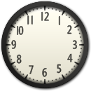
The Clock gadget displays an analog clock with rotating hour, minute, and second hands.
Gadgets Remix — a modern web reimplementation of the Windows Vista Sidebar Gadgets.
A glass-domed analog clock. Uses CSS transform: rotate() for the hands,
replacing the original <g:image>.Rotation API.




vista.css
Show code
<div class="gadget-clock">
  <img class="clock-face" src="gui/gadgets/clock/images/trad.png" alt="Clock face" />
  <img class="clock-hand hour" src="gui/gadgets/clock/images/trad_h.png" alt="" />
  <img class="clock-hand minute" src="gui/gadgets/clock/images/trad_m.png" alt="" />
  <img class="clock-hand second" src="gui/gadgets/clock/images/trad_s.png" alt="" />
  <img class="clock-dot" src="gui/gadgets/clock/images/trad_dot.png" alt="" />
  <img class="clock-glass" src="gui/gadgets/clock/images/trad_highlights.png" alt="" />
  <div class="clock-name">vista.css</div>
</div>
<script src="gui/gadgets/clock/clock.js"></script>Gadget — Calendar
The Calendar gadget shows the current month with an orange highlight for today.
Gadgets Remix — a modern web reimplementation of the Windows Vista Sidebar Gadgets.
Browse months with arrow buttons, click title or curl to return to today. Background uses original Vista Sidebar glass color for the page texture to show.



Show code
<div class="gadget-calendar">
  <img class="cal-bg" src="gui/gadgets/calendar/images/calendar_single.png" alt="" />
  <img class="cal-ring" src="gui/gadgets/calendar/images/calendar_ring_docked.png" alt="" />
  <div class="cal-nav">
    <img src="gui/gadgets/calendar/images/bprev.png" alt="Previous" />
    <span class="cal-nav-title"></span>
    <img src="gui/gadgets/calendar/images/bnext.png" alt="Next" />
  </div>
  <div class="cal-grid-container">
    <div class="cal-grid"></div>
  </div>
  <img class="cal-curl" src="gui/gadgets/calendar/images/curl.png" alt="Today" title="Return to today" />
</div>
<script src="gui/gadgets/calendar/calendar.js"></script>Gadget — Notes
The Notes gadget provides sticky notes with a handwriting-style font and multiple pages.
Gadgets Remix — a modern web reimplementation of the Windows Vista Sidebar Gadgets.
Write, add, delete, and navigate between notes. Notes persist in localStorage.
Controls appear on hover.

1 / 1


Show code
<div class="gadget-note">
<img class="note-bg" src="gui/gadgets/notes/images/sticky_yellow.png" alt="" />
<textarea class="note-text" placeholder="Type a note…"></textarea>
<div class="note-controls">
<img src="gui/gadgets/notes/images/sticky_left_rest.png" alt="Previous" />
<div class="note-page-counter">
<span class="note-page-text">1 / 1</span>
</div>
<img src="gui/gadgets/notes/images/sticky_right_rest.png" alt="Next" />
<img src="gui/gadgets/notes/images/sticky_plus_rest.png" alt="Add note" />
<img src="gui/gadgets/notes/images/sticky_delete_rest.png" alt="Delete note" />
</div>
</div>
<script src="gui/gadgets/notes/notes.js"></script>Gadget — CPU Meter
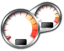
The CPU Meter gadget displays CPU and memory usage as analog gauges with rotating needles.
Gadgets Remix — a modern web reimplementation of the Windows Vista Sidebar Gadgets.
Two analog dials — CPU (left) and Memory (right). Needles rotate via CSS
transform: rotate(). Percentage labels update in real time using mock data.
The original relied on System.Machine.CPUs and
<g:image>.addTextObject(), both replaced here with standard web equivalents.

0%
0%
Show code
<div class="gadget-cpu">
  <img class="cpu-bg" src="gui/gadgets/cpu/images/back.png" alt="" />
  <img class="cpu-needle cpu-needle-cpu" src="gui/gadgets/cpu/images/dial.png" alt=""
    style="top:12px;left:35px;width:8px;height:72px;transform-origin:50% 50%;transform:rotate(-135deg);" />
  <img class="cpu-needle cpu-needle-mem" src="gui/gadgets/cpu/images/dial.png" alt=""
    style="top:3px;left:89px;width:8px;height:50px;transform-origin:50% 50%;transform:rotate(-135deg);" />
  <img class="cpu-dot" src="gui/gadgets/cpu/images/dialdot.png" alt="" />
  <img class="cpu-glass" src="gui/gadgets/cpu/images/glass.png" alt="" />
  <div class="cpu-label cpu-label-cpu">0%</div>
  <div class="cpu-label cpu-label-mem">0%</div>
</div>
<script src="gui/gadgets/cpu/cpu.js"></script>Gadget — Currency
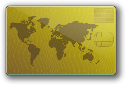
The Currency gadget converts between world currencies.
Gadgets Remix — a modern web reimplementation of the Windows Vista Sidebar Gadgets.
Currency converter with mock exchange rates. Uses the original Vista glassmorphic card backgrounds.
Original used ActiveX wlsrvc.WLServices for MSN Money data.
USD
=
EUR
=
GBP
=
JPY
Show code
<div class="gadget-currency">
  <img class="currency-bg" src="gui/gadgets/currency/images/base-undocked-2.png" alt="" />
  <div class="currency-content">
    <div class="currency-row">
      <input type="number" value="1" step="0.01" />
      <span class="currency-code">USD</span>
    </div>
    <div class="currency-row">
      <input type="number" value="0.85" readonly />
      <span class="currency-equals">=</span>
      <span class="currency-code">EUR</span>
    </div>
    <div class="currency-row">
      <input type="number" value="0.73" readonly />
      <span class="currency-equals">=</span>
      <span class="currency-code">GBP</span>
    </div>
    <div class="currency-row">
      <input type="number" value="110.0" readonly />
      <span class="currency-equals">=</span>
      <span class="currency-code">JPY</span>
    </div>
  </div>
</div>
<script src="gui/gadgets/currency/currency.js"></script>Gadget — Stocks
The Stocks gadget tracks stock prices with up/down indicators.
Gadgets Remix — a modern web reimplementation of the Windows Vista Sidebar Gadgets.
Mock stock data with symbol, price, and original Vista up/down indicator icons.
Original used ActiveX wlsrvc.WLServices for MSN Money stock data.
Mock data — 15 min delay
Show code
<div class="gadget-stocks">
<img class="stocks-bg" src="gui/gadgets/stocks/images/stocks_docked_1.png" alt="" />
<div class="stocks-content">
<div class="stocks-rows"></div>
<div class="stocks-status">Mock data — 15 min delay</div>
</div>
</div>
<script src="gui/gadgets/stocks/stocks.js"></script>Gadget — Weather
The Weather gadget displays current conditions, temperature, and a 3-day forecast.
Gadgets Remix — a modern web reimplementation of the Windows Vista Sidebar Gadgets.
Uses the original Vista BLUE theme background and weather state icons at exact pixel positions.
Original used ActiveX wlsrvc.WLServices for MSN Weather data.


Show code
<div class="gadget-weather">
<img class="weather-bg" src="gui/gadgets/weather/images/BLUE-base.png" alt="" />
<img class="weather-visual" src="gui/gadgets/weather/images/undocked_sun.png" alt="" />
<div class="weather-highlights">
<img src="gui/gadgets/weather/images/BLUE-highlight-01.png" alt="" />
<img src="gui/gadgets/weather/images/BLUE-highlight-02.png" alt="" style="z-index:5;" />
</div>
<div class="weather-content">
<div class="weather-temp">72°</div>
<div class="weather-condition">Sunny</div>
<div class="weather-location">
<a href="#">Redmond, WA</a>
</div>
<div class="weather-hilo">
<table cellpadding="0" cellspacing="0">
<tr>
<td class="temp-high">78°</td>
<td class="temp-sep">/</td>
<td class="temp-low">58°</td>
</tr>
</table>
</div>
<div class="weather-forecast">
<table cellpadding="0" cellspacing="0">
<tr>
<td class="forecast-day" colspan="2">Mon</td>
<td class="forecast-sep-v" rowspan="2"></td>
<td class="forecast-day" colspan="2">Tue</td>
<td class="forecast-sep-v" rowspan="2"></td>
<td class="forecast-day" colspan="2">Wed</td>
</tr>
<tr>
<td class="forecast-temps"><span class="high">75°</span><br><span class="low">62°</span></td>
<td class="forecast-icon-cell"><img src="gui/gadgets/weather/images/sky-sunny.png" alt="" /></td>
<td class="forecast-temps"><span class="high">68°</span><br><span class="low">55°</span></td>
<td class="forecast-icon-cell"><img src="gui/gadgets/weather/images/sky-cloudy.png" alt="" /></td>
<td class="forecast-temps"><span class="high">71°</span><br><span class="low">58°</span></td>
<td class="forecast-icon-cell"><img src="gui/gadgets/weather/images/sky-partlycloudy.png" alt="" /></td>
</tr>
</table>
<div class="weather-separator"><div></div></div>
<div class="weather-attribution">Powered by MSN Weather</div>
</div>
</div>
</div>Gadget — SlideShow
The SlideShow gadget displays a continuous image slideshow with a glass frame overlay.
Gadgets Remix — a modern web reimplementation of the Windows Vista Sidebar Gadgets.
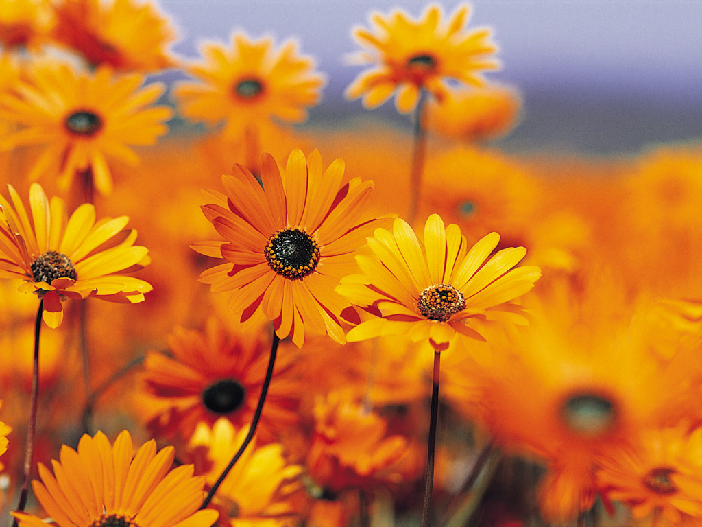
Cycles images every 5 seconds. Uses the original Vista glass frame (undocked, 360×280) and control button PNGs. Controls appear on hover.


Show code
<div class="gadget-slideshow">
  <img class="slideshow-image" src="gui/gadgets/slideshow/images/Garden.jpg" alt="Slideshow" />
  <img class="slideshow-glass" src="gui/gadgets/slideshow/images/slideshow_glass_frame.png" alt="" />
  <div class="slideshow-controls">
    <img src="gui/gadgets/slideshow/images/prev_rest.png" alt="Previous" />
    <img src="gui/gadgets/slideshow/images/pause_rest.png" alt="Pause" />
    <img src="gui/gadgets/slideshow/images/play_rest.png" alt="Play" />
    <img src="gui/gadgets/slideshow/images/next_rest.png" alt="Next" />
  </div>
</div>
<script src="gui/gadgets/slideshow/slideshow.js"></script>Gadget — Picture Puzzle
The Picture Puzzle gadget is a classic 4×4 sliding puzzle using original Vista puzzle images.
Gadgets Remix — a modern web reimplementation of the Windows Vista Sidebar Gadgets.
Each tile is a 27×27 section of a 108×108 puzzle image (1.png), with the original tile bezel and drop shadow overlays. Exact tile dimensions from source: tileSize=27, gridSize=4, pad 110×110.
 0:00
0:00

Show code
<div class="gadget-puzzle">
  <img class="puzzle-bg" src="gui/gadgets/puzzle/images/background.png" alt="" />
  <div class="puzzle-bar">
    <img class="puzzle-timer-img" src="gui/gadgets/puzzle/images/timer_up.png" alt="" />
    <span class="puzzle-timer">0:00</span>
    <img class="puzzle-shuffle" src="gui/gadgets/puzzle/images/shuffle_up.png" alt="Shuffle" title="Shuffle" />
  </div>
  <div class="puzzle-pad"></div>
</div>
<script src="gui/gadgets/puzzle/puzzle.js"></script>Bubbles Screensaver
An interactive replica of the classic Windows Vista Bubble screensaver, rendered in real-time using WebGL with a physically accurate thin-film interference model. Bubbles drift, collide, and shimmer with authentic rainbow iridescence.
The rendering implements the method described in
"Real-time Rendering of Soap Bubbles Taking into Account Light Interference"
by Iwasaki, Matsuzawa & Nishita (CGI 2004, University of Tokyo).
Thin-film reflectivities are precomputed from the spectral interference
equation and stored as a 2D texture indexed by film thickness and
incident angle. At render time, a two-pass GPU pipeline per frame
applies the paper's exact blend equation:
Lp = (1 − R) × Lit + R × Lir, producing 1000× faster
rendering than ray tracing while preserving the physics of wavelength-dependent
interference fringes.
The bubble overlays the entire page as a canvas element, appearing after 5 seconds of inactivity — just like the original screensaver. Move the mouse or press a key to dismiss it temporarily.
Issues, Contributing, etc.
vista.css is MIT licensed. Refer to the GitHub repository to report issues or contribute.
Built as an extension of 7.css, vista.css reimagines the Windows Vista Aero interface for the web.
Windows Vista, Aero, and the extracted icon and gadget assets are © Microsoft Corporation. Assets sourced from archive.org. See NOTICE.md for full attribution.